thoughtfully designed

Menu

Filter

Social

The party is over

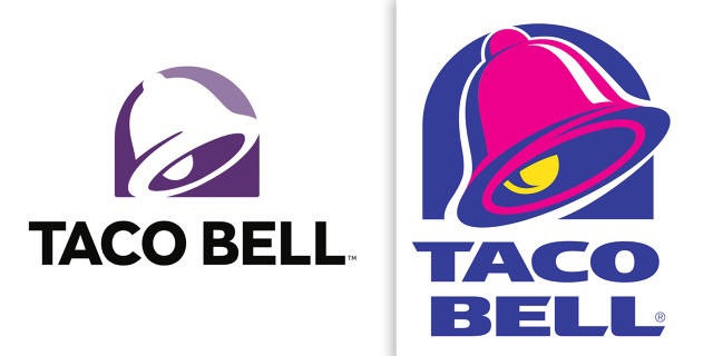
Oh Taco Bell, what have you done to you once 90’s-rific logo? It seems you’ve take all of the fiesta out of your fiesta taco supreme. I love Helvetica and its first cousin Akzidenz-Grotesk, but they strive for neutrality. Not what I’d go for in a low-end, fast-food ,Tex-Mex restaurant.

Read this article on FastCo.

Rebranded

For all of my life I have been Paula Snyder. PBS. PS. The end. Until I got engaged…

Now along with wedding planning and invitation design I’ve added rebranding myself with my new name to my list of “to do’s” before I get married next month. I will now be Giver Creative. And as a typography junky I couldn’t be more excited. S is a fun letter to design with. It lends itself to lots of scripty loops and fun swirls, but G… G is a COOL LETTER! There are so many different kinds of Gs. Uppercase Gs and Cursive Gs and and grade-school-esque simple sans serif Gs and then my ultimate favorite… the stacked g. So here I go… wading into the world the uncharted monogram, ears, links and loops.

GiverCreative_logo_stacked GiverCreative_logo_horizontalGC_buscard copy